For starters, Prowly reveals its brand new face. Check out our new logo and redesigned interface.
Throughout the last year, Prowly has learnt a lot as a company. We believe that our new mission and the changes in visual identity that follow will be able to convey these important ideas to you.
Why are we here? To give people independence and help them unlock their superpowers in everyday PR work. Prowly implements this mission both as a tool and as a team of people working together from a single virtual office every day.
Why are we here? To give people independence and help them unlock their superpowers in everyday PR work. Prowly implements this mission both as a tool and as a team of people working together from a single virtual office every day.
Meet the new Owl
We are all very sentimental about it, which is why we gave it a delicate facelift aiming simplification (and better responsiveness on different types of devices). As a sign of maturity, the owl changes the color of its plumage to blue. Following the evolution of the brand logo, we also reviewed our typography. The name Prowly was previously a sundial, and now it is in sans-serif. Zeitung, the font that we are now using for headlines, is a press-font dedicated to, among other things, headlines in printed press titles.

New logo
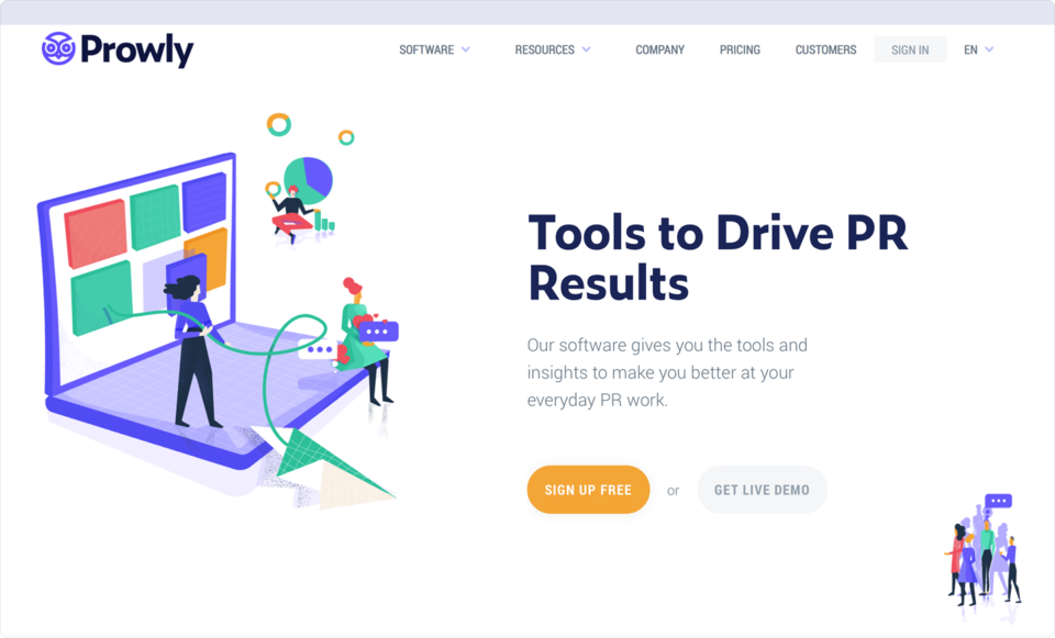
This is our new visual identity which aims to humanize our brand and emphasize the superpowers that follow. Our Lead Designer, Marta Olczak, together with my co-founder Sebastian Przyborowski, have been working to create original illustrations for a few solid months. From now on, the new visual identification will accompany you everywhere – from the product page to the farthest flung corners of our app, where you will be getting some guidance on how to use it.

New website design
New interface design
Last but not least, we present the icing on the cake of changes in the way Prowly will look! The new visual identification will be followed by a refreshed interface of the application. From now on, its heart will be the new menu, around which all daily work revolves. Each module has a dedicated part in it, so that all the useful functions are always close at hand. The menu is context-sensitive – it changes depending on your current location in the application. Each view contains a section called actions, which is a package of the most frequently used features in individual modules.
Apart from the menu view, the whole interface has gone through a top-down redesign process . Each window, each view, and each form has been reinvented, taking into account feedback from our users. Starting now, individual modules will be communicating with each other allowing you to see the same data from different angles and easily jump from one view to another. In addition, in almost every view you will now see contextual information, help, and some useful tips showing you how to improve things, as we’ve placed particular emphasis on delivering useful data to our users on a daily basis!
We also have some great news for the fans of our current interface – the plus button remains untouched.
In the next episode, we will show you what changes await the control panel of one of our classics, the Brand Journal.
In the next episode, we will show you what changes await the control panel of one of our classics, the Brand Journal.

